

These are the final produced designs for my wristbands that will be given out at the event.


This is the finished and completed version of my bikini kill poster that I am going to send to my client. After various amounts of emails we have come to an agreement and there have been a few slight adjustments along the way but they have all been minor and I have enjoyed working for a real client.
I have learnt that i should always add a 'sample' indication to my work just show that it is actually a 'sample' and that it is still mine until I have handed it over!

I have been approached to do some work for an event that is being held at the elbow rooms, Lauren Moss a writer from the no title magazine has sent me a brief to produce a poster design for bikini kill and my logo/name etc will be placed on it so that will be could to get my work recognised by people and maybe get some contacts.From my selection of designs and colour arrangments i decided to go with these two inparticular pink colours with white type.


 These are my initial layouts for the poster for the night 'Bikini Kill'.. i have tried to use a limited colour palette and lay out the type effectively and clear, i think with these initial designs here I have not considered the type heirarchy properly, I need to make sure that the type reads clearly and that people are reading the most important things first!

 I decided that some of the type was lost with it all being white so i decided to highlight some of it in black, the important information mainly to help with the heirarchy of type and how the type was read.
 Here below i have again changed the composition of the type, i found that the layout above was all a bit of a mess and there looked like there was too much information so I spaced it out a little and it has really helped with the legibility of the composition.

I took the bikini kill from my poster and thought i could experiment slightly with the text instead of just keeping it plain BEBAS. I am quite liking the 'bikini kill' with the line going through the kill, it kind of emphasis's death and killing, like putting a stop to something. I have experimented with the blood/paint effect adding more layers to the image and experimenting with different colours.
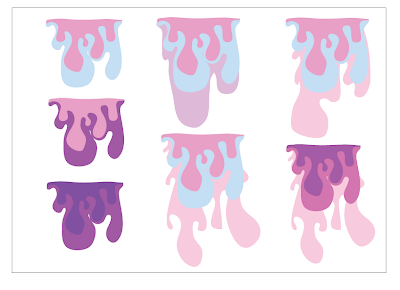

I have been approached to do some work for an event that is being held at the elbow rooms, Lauren Moss a writer from the no title magazine has sent me a brief to produce a poster design for bikini kill and my logo/name etc will be placed on it so that will be could to get my work recognised by people and maybe get some contacts.
This is the first initial vectored image that i made that i thought i could work with, linking in with the whole burlesque feel and vibe.

 I decided that some of the type was lost with it all being white so i decided to highlight some of it in black, the important information mainly to help with the heirarchy of type and how the type was read.
 Here below i have again changed the composition of the type, i found that the layout above was all a bit of a mess and there looked like there was too much information so I spaced it out a little and it has really helped with the legibility of the composition.
I took the bikini kill from my poster and thought i could experiment slightly with the text instead of just keeping it plain BEBAS. I am quite liking the 'bikini kill' with the line going through the kill, it kind of emphasis's death and killing, like putting a stop to something.
 I have experimented with the blood/paint effect adding more layers to the image and experimenting with different colours.


No comments:
Post a Comment